モデルが行う「画像の分類」の内容は,画像が各類に属する確率である。
この表現形式の分類を,「prediction」と呼ぶ:
>>> predictions = model.predict(x_test)
最初の画像の prediction は:
>>> predictions[0]
array([6.2597333e-06, 4.3360582e-09, 2.0390084e-05, 4.1531216e-04,
1.2437715e-09, 1.7457477e-06, 1.8881036e-10, 9.9954408e-01,
3.7411795e-07, 9.5864243e-06], dtype=float32)
一番確信度が高いラベルは:
>>> import numpy as np
>>> np.argmax(predictions[0])
7
そして実際は:
当たりである。
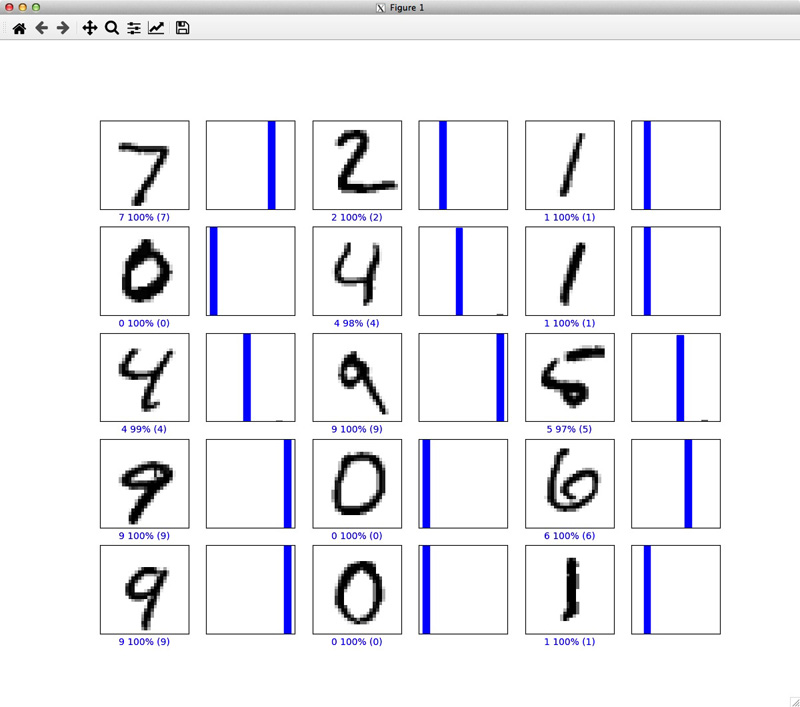
prediction をグラフに表してみる
──最初の10枚の画像に対する prediction:
$ vi predictions.py
|
#!/usr/bin/env python
from tensorflow import keras
import numpy as np
import matplotlib.pyplot as plt
# data
mnist = keras.datasets.mnist
(x_train, y_train), (x_test, y_test) = mnist.load_data()
class_names = ['0', '1', '2', '3', '4', '5', '6', '7', '8', '9']
# image-preprocessing
x_train = x_train / 255.0
x_test = x_test / 255.0
# model setup
model = keras.Sequential([
keras.layers.Flatten(input_shape=(28, 28)),
keras.layers.Dense(128, activation='relu'),
keras.layers.Dense(10, activation='softmax')
])
model.compile(optimizer='adam',
loss='sparse_categorical_crossentropy',
metrics=['accuracy'])
# training
model.fit(x_train, y_train, epochs=5)
# prediction
predictions = model.predict(x_test)
def plot_image(i, predictions_array, true_label, img):
predictions_array, true_label, img = predictions_array[i], true_label[i], img[i]
plt.grid(False)
plt.xticks([])
plt.yticks([])
plt.imshow(img, cmap=plt.cm.binary)
predicted_label = np.argmax(predictions_array)
if predicted_label == true_label:
color = 'blue'
else:
color = 'red'
plt.xlabel("{} {:2.0f}% ({})".format(class_names[predicted_label],
100*np.max(predictions_array),
class_names[true_label]),
color=color)
def plot_value_array(i, predictions_array, true_label):
predictions_array, true_label = predictions_array[i], true_label[i]
plt.grid(False)
plt.xticks([])
plt.yticks([])
thisplot = plt.bar(range(10), predictions_array, color="#777777")
plt.ylim([0, 1])
predicted_label = np.argmax(predictions_array)
thisplot[predicted_label].set_color('red')
thisplot[true_label].set_color('blue')
# prediction : test-image 0 - 14
num_rows = 5
num_cols = 3
num_images = num_rows*num_cols
plt.figure(figsize=(2*2*num_cols, 2*num_rows))
for i in range(num_images):
plt.subplot(num_rows, 2*num_cols, 2*i+1)
plot_image(i, predictions, y_test, x_test)
plt.subplot(num_rows, 2*num_cols, 2*i+2)
plot_value_array(i, predictions, y_test)
plt.show()
|
$ chmod +x predictions.py
$ ./predictions.py
Train on 60000 samples
Epoch 1/5
60000/60000 [==============================] - 24s 398us/sample - loss: 0.2648 - acc: 0.9247
Epoch 2/5
60000/60000 [==============================] - 23s 388us/sample - loss: 0.1160 - acc: 0.9656
Epoch 3/5
60000/60000 [==============================] - 23s 391us/sample - loss: 0.0802 - acc: 0.9753
Epoch 4/5
60000/60000 [==============================] - 24s 392us/sample - loss: 0.0597 - acc: 0.9818
Epoch 5/5
60000/60000 [==============================] - 24s 393us/sample - loss: 0.0459 - acc: 0.9863
|
